I am thinking about my ten minute introduction for next week’s Producing Data event.
I want to talk about data visualisation as a profession and its position in the data supply chain. I am reminiscent as I write of Micheal Pryke’s very interesting paper on the “money eye” when he says ““Numbers are not everything”. Interestingly, Pryke’s is one of the few papers where fieldworker ventures into the realm of computational architecture groups that are responsible of shaping the way (analyst and ourselves) perceive markets.
Next tuesday 2nd of September we will have the privilege of hosting one of them. I met Hermann Zchiegner of www.two-n.com thanks to our common friend and colleague Gordon Haywood in 2012. Hermann was Edinburgh to work to a new data visualisation project at Wood MacKenzie and I interviewed him. Here is one excerpt:
Hermann Zchiegner: “Working with data you are working with something that is there, that is factual. Applying a visualization layer on top of data brings a certain bias with it. You know, based on the same dataset, it can create two very different sorts of pictures. This is one of the biggest challenges of data visualization anyway…to have as much as you can an unbiased view, unless is serving the purpose. I want to help me making an argument with these sets of data. That’s a different kind of story. There is this unbiased view: give me the data, let me help you understand the data, let the data speak to you. The role of the dataviz guy is in a certain way very much so a creative process because you are creating something out of the context of the data that in itself becomes something new, that stands for itself. There is this big difference between data visualization and this big thing that is becoming more and more predominant that is infographics. Data visualization relies of data sets where we have data notes in the hundreds of thousands. Infographics usually deals with small datasets and its purpose is always artistic: I drawing you a picture of a fact. Whilst data visualization is open ended because you are just creating a framework for the data to speak but you are not creating an end product. You are really just creating the framework.”
What I really wanted to understand at that time was when and to what extent pictures bias numbers. I really wanted to find an evidence of this performativity. Hermann’s words hinted at that direction.
My research progressed from that into the study of how even the simple figurations – the dot, the line, the list, the two by two matrix make a difference. I read with great enjoyment Micheal Lynch description of the ‘device of the dot’, Tim Ingold book – an entire book! – on the line. And Chris Carter and Mark Kornberger’s analysis of how a list can make a difference, creating competition between previously unrelated entities and magnifying irrelevant difference (such as the difference between ‘first’ and ‘second’).
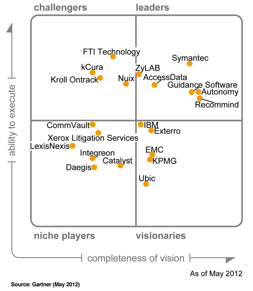
I worked over the last few years on the idea that even big numbers and complex calculations need to come down to something people can communicate and understand. Something that they can use to take decisions.My own empirical field of research being the IT market – IT business consultancy and analysis – I started doing research in collaboration with Neil Pollock on the (in)famous Magic Quadrant.
A very simple but very influential figuration in business analysis. What people see in it? I found that watching the Magic Quadrant the trained eye can recognise at a glance that a mature market has the shape of a “rugby ball”. I also discover that to be effective, a certain (very well defined) number of entities need to be represented. When not enough entities (vendors) are naturally available in a market, the “range” need to be somehow produced. We therefore also discovered that the matrix is not only about taking away, simplifying. it is also about adding sometime.
However, fascination for more complex visualisations and dynamic datasets never abandoned me. Since my last meeting with Gordon I also drafted a new course, part of our new distance learning programme in “Making Use of Digital Research” (yes thanks for finding the title creative!). The course is about “Understanding Data Visualisation” and will host talks from a number of data designers. There we will discuss with students the difference between pie chart, bar chart, heat maps and all the most popular figurations to represent dynamic datasets. Also Gartner seems to have turned to a more dynamic magic quadrant nowadays!
Let’s see where we are when Hermann visits us next in 2016!
We use cookies to ensure that we give you the best experience on blogs.sps.ed.ac.uk. You can adjust all of your cookie settings by navigating the tabs on the left hand side.
Strictly Necessary Cookies
Strictly Necessary Cookie should be enabled at all times so that we can save your preferences for cookie settings.
If you disable this cookie, we will not be able to save your preferences. This means that every time you visit this website you will need to enable or disable cookies again.
Google Analytics
Some sites at blogs.sps.ed.ac.uk use Google Analytics to collect anonymous information such as the number of visitors to the site, and the most popular pages. The data help us improve the experience of using our site.
Please enable Strictly Necessary Cookies first so that we can save your preferences!
Privacy and cookies policy
Please see the School of Social and Political Science's privacy and cookies page. In addition to the cookies described there, blogs.sps.ed.ac.uk also uses the following cookies:
WordPress: wordpress_test_cookie
WordPress is the content management system (CMS) used to build blogs.sps.ed.ac.uk
Wordfence: wordfence_verifiedHuman, wfvt_
Wordfence is a WordPress security package
Twitter: personalization_id, guest_id, external_referer, ct0, _twitter_sess
Twitter is a microblogging social media service